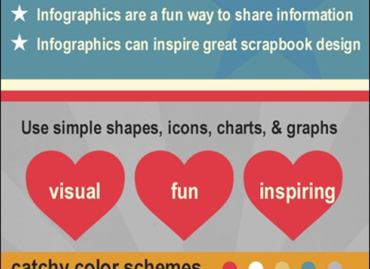
You’ve seen and heard of infographics; now is the time to create one yourself! An infographic takes a large amount of information in text or numerical form and condenses it into a combination of images and text, allowing viewers to quickly grasp the essential insights the data contains.
There are eight types of infographics. Knowing the types can make outlining your content and finding an appropriate design much easier.
This is adapted from How to get started with infographics by Dana Malstaff
Subject Specific: Provides all of the facts about one thing or topic
a. Talks about benefits or risks
b. Includes researched statistics
c. Generally only includes validated and widely accepted recommendations
d. Meant to be educational
e. Is fact based
Brand Specific: All about a product, company or brand
a. Similar to a subject specific
b. Meant to help sell a product or promote a brand
c. Usually includes statistics & comparisons
d. Should utilize brand colors, fonts and feel, unless you are not the owner of the brand
How to: Tells the reader how to do something
a. Usually has numbered instructions
b. Walks the reader through a process
c. The steps can be based on research or based on experience
Recommendations: Provides your recommendations
a. Can be based partly on fact, but also includes your personal insight
b. Often times is masked by a How to, or other title, but always includes specific recommendations mixed with facts and quotes
c. Can be a ‘guide’ or have numbers
Time Sensitive: Covers a time sensitive subject
a. Can be just about anything that is relevant for a particular time.
(i.e. political, news, social, product launch, industry specific, etc.)
b. Is generally used to get a large number of views because if the increased searchability of the topic
c. Need to consider large influx vs longevity of being relevant
The History Of: Walks the reader through a timeline
a. Usually includes years
b. Can walk through the life of a person, product, movement, event, etc.
c. Is great to show how something has changed, grown, or affected us
Decision Tree: Breaks down a process depending on our choices
a. Include yes/no branches
b. Are great to show the reader the consequences of certain decisions
c. Can get complicated
Top #: Gives the top # (number varies) of something
a. Can be the top # by success
b. Can be the top # by your recommendation
c. Can be the top # of benefits or risks
d. Can be a comparison list
e. The list goes on and on
Easel.ly is a website that features thousands of free infographic templates and design objects which users can customize to create and share their visual ideas online or print. Using the site is as easy as dragging and dropping design elements; users can either choose a template from their extensive library or they can upload their own background image and start from scratch. Thousands of users have already registered with Easel.ly and thousands of infographics are produced using the site every month. They have also created an easy-to-use guidebook that is available by clicking here.
Go on … get creative and design an infographic at www.easel.ly!

